One of my favorite of Steve Jobs’ quotes — if not THE favorite — is this:
People think it’s this veneer — that the designers are handed this box and told, ‘Make it look good!’ That’s not what we think design is. It’s not just what it looks like and feels like. Design is how it works.
It’s a sentiment echoed in the philosophy behind Apple’s completely rethought new design language for the forthcoming iOS7, just announced this week:
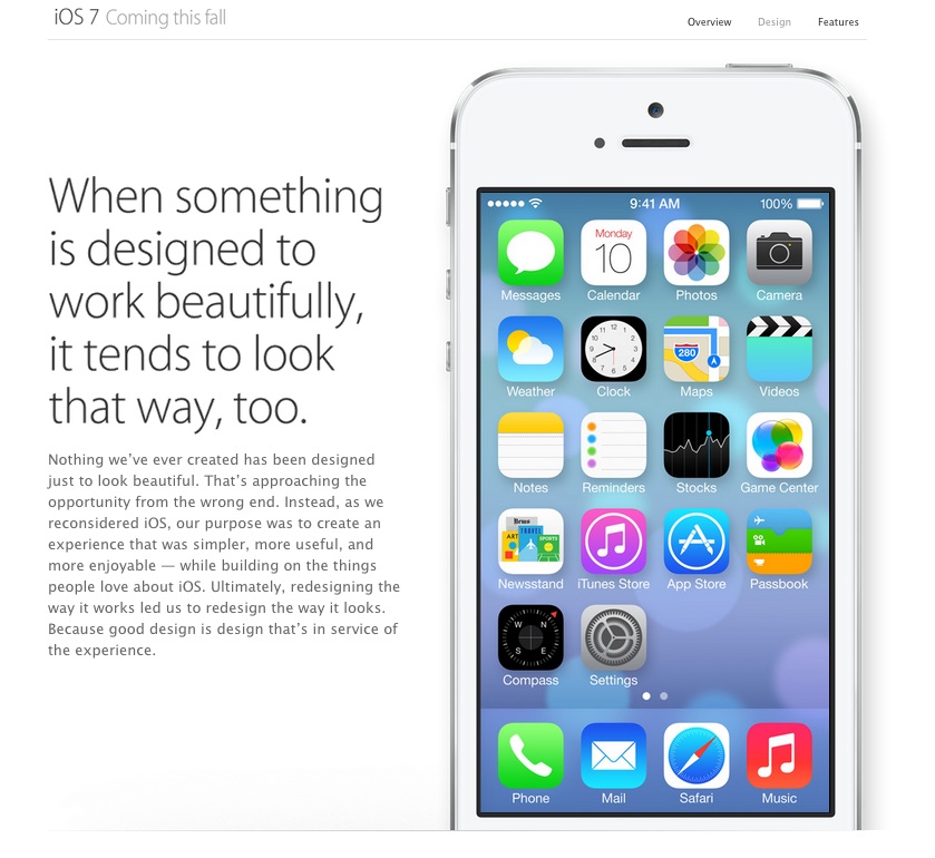
Nothing we’ve ever created has been designed just to look beautiful. That’s approaching the opportunity from the wrong end. Instead, as we reconsidered iOS, our purpose was to create an experience that was simpler, more useful, and more enjoyable — while building on the things people love about iOS. Ultimately, redesigning the way it works led us to redesign the way it looks. Because good design is design that’s in service of the experience.
This is not only a standard that Apple holds itself to, it now extends to all those who develop on the iOS platform with comprehensive guidelines on how third party developers should design for iOS 7 to match Apple’s own style. As TechCrunch puts it, “Developers will have to adapt their apps to match the rest of the operating system if they don’t want them to look antiquated.”
Here are Apple’s three main themes for developing for iOS 7:
Deference. The UI helps users understand and interact with the content, but never competes with it.
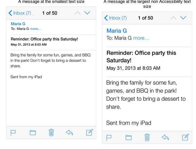
Clarity. Text is legible at every size, icons are precise and lucid, adornments are subtle and appropriate, and a sharpened focus on functionality motivates the design.
Depth. Visual layers and realistic motion heighten users’ delight and understanding.
On Apple’s list of things app developers should do to get ready for iOS 7 are instructions like: “Revisit the use of drop shadows, gradients, and bezels. Because the iOS 7 aesthetic is smooth and layered—with much less emphasis on using visual effects to make UI elements look physical — you may want to rethink these effects.”
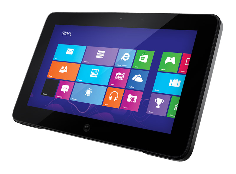
This kind of “smooth” digital design aesthetic, that rejects the skeuomorphism of making icons on a flat screen look like 3-dimensional, analog objects, has a name — “flat design.” And Apple was not even the first to adopt it. (They were the last holdout, in fact). Microsoft and Google got there first. Back in 2011, when Microsoft unveiled its “Metro” design language, now simply referred to as “Windows 8,” its design principles were:
Clean, Light, Open and Fast
We took an approach that we call “Fierce Reduction” to remove any elements in the UI that we felt were unnecessary; both visual elements and feature bloat. It allows us to shine a focus on the primary tasks of the UI, and makes the UI feel smart, open, fast, and responsive.
Alive in Motion
The transitions between screens in a UI are as important the design of the screens themselves. Motion gives character to a UI, but also communicates the navigation system, which helps to improve usability.
Celebrate Typography
Our design inspiration is very typographic, and it felt like it was time for User Interfaces to be uncompromising about type as well. Type is information, type is beautiful.
Content, Not Chrome
It’s the content on the phone that people want, not the buttons. Reducing the visuals on the phone that aren’t content will help you create a more open UI, and it also promotes direct interaction with the content.
Authentically Digital
Finally, we believe in honesty in design. A user interface is created of pixels, so in Metro we try to avoid using the skeumorphic shading and glossiness used in some UI’s that try to mimic real world materials and objects.
With Apple joining the tech trifecta, (“Leading by following“), Flat Design has been transformed from a trend into a manifesto. It is a fundamental philosophical shift from what’s come before in what design’s role is in the natively digital experience.
Living in L.A. it’s very easy for all metaphors and analogies to get reduced to the automotive experience. So here we go — for a long time in the web, we had the same people, approaching in the same way, the design of something like this:

And something like this:
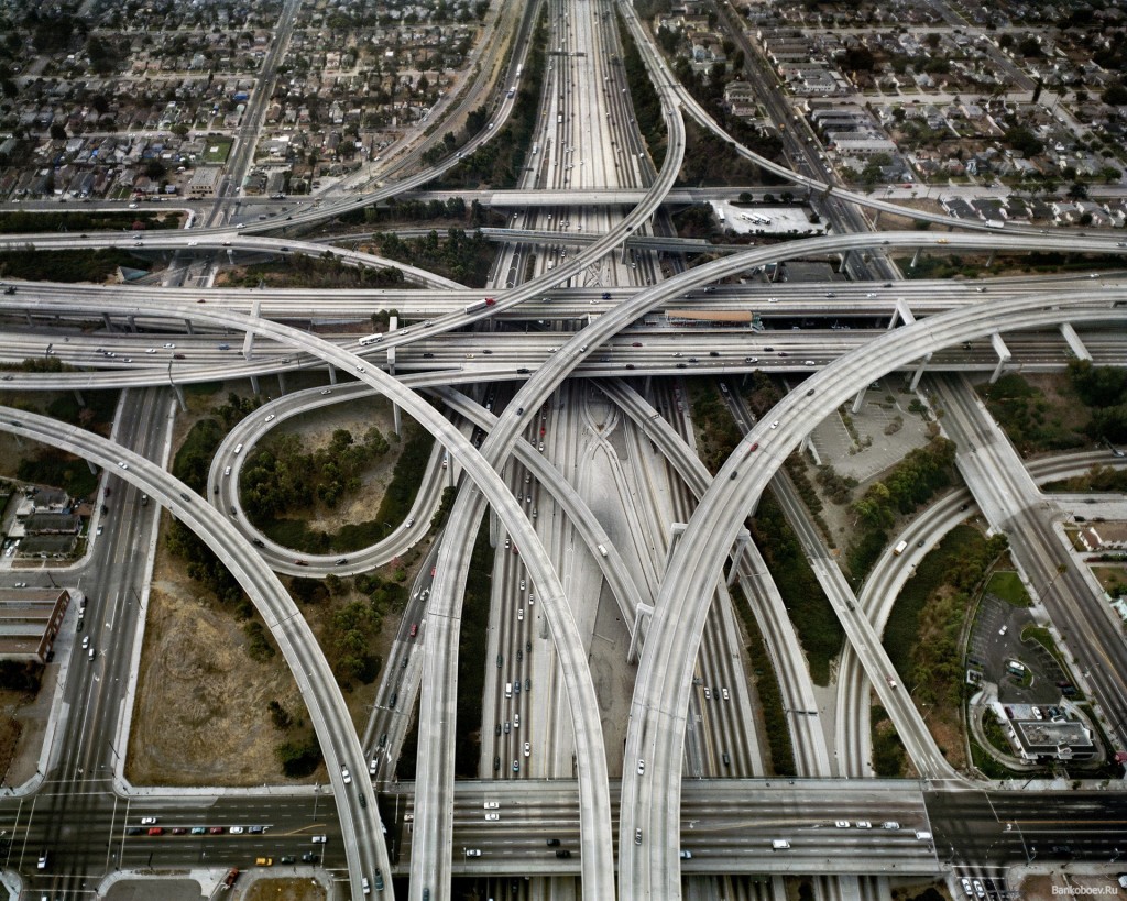
I mean, we just didn’t know any better. We didn’t really grasp that we needed completely different types of design philosophies. All we knew was that things on the web had to…. look….. like something….. Maybe … something pretty?…. Or… Cool? Anyway, we had to get designers. To design them. And what visual arts genius was going to want to create a digital masterpiece that looks like they were barely there in the first place?
Orite…. Apple.
For many a designer — sadly, still — whatever the reason a user has come to the destination they are designing, it is second to the privilege of being exposed to the designer’s creative brilliance and superior taste.
Apple is saying, this is where we are as a culture: we’re past that now. Apple wants “designers” to get out the way. Users are not here to marvel at your “design.” They’re here to get to the shit your design is jumping up and down, waving its hands frantically trying to get attention, getting in the way of. Apple wants to make it very clear that the UI — that layer between the human, and the content that this human is trying to access, aka the “design” layer — is not the star. It should, quote, “play a supporting role.”
Commuters don’t care about your “creative vision.” They are just trying to get fucking home.
If you want to be Dali, you should probably not be a freeway designer. But if you want to design freeways — or iOS experiences — then your art is about making something sublimely useful, usable, and effective. This is what the companies defining the way we access the digital world all stand for now. This is what they believe makes for a beautiful experience on their devices and on their operating systems.
“Web design” is dead because everywhere the “design layer” of the web is being sandblasted off, the interface reduced down to its barest essence. This is why the new, natively digital design disciplines are found deep beyond the surface of aesthetics, in user experience design, in information architecture, in interaction design.
More than ever, Jobs’ words are true: design is now a fundamentally inextricable part of how it works.
There’s simply not much room left for anything else.
And if you think you’ll at least get to choose the colors based on your personal design taste…. like Apple says, “you may want to rethink” that as well.
From Fast Company’s “The Science Behind Colors in Marketing“:
“Green connotes ideas like “natural” and “environment,” and given its wide use in traffic lights, suggests the idea of “go” or forward movement. The color red, on the other hand, is often thought to communicate excitement, passion, blood, and warning. It is also used as the color for stopping at traffic lights. Red is also known to be eye-catching.”
So, clearly an A/B test between green and red would result in green, the more friendly color. At least that was their guess. Here is what their experiment looked like:
The red button outperformed the green button by 21%.
What’s most important to consider is that nothing else was changed at all: 21% more people clicked on the red button than on the green button. Everything else on the pages was the same, so it was only the button color that made this difference.