Violate Me

miley_cyrus_vmas-620x412

Here is what I can tell you. When I was in New York a month ago and one night someone suggested we go to an MTV party, the first thought I had was — wait, MTV still exists?

But I guess it does because this week I’ve spent a lot of time talking about MTV. Well, not really so much MTV as the MTV Video Music Awards. Well, not even that, so much as Miley Cyrus’s performance. Yeah, I’ve spent a lot of time talking about Miley Cyrus’s performance at the VMAs. And so has the rest of America. Not only was a story about her performance the main event on the CNN homepage the next day, I then saw The Onion’s fictional op-ed, ostensibly written by the managing editor of CNN.com, with the headline, “Let Me Explain Why Miley Cyrus’ VMA Performance Was Our Top Story This Morning” (CNN spoiler alert: ad revenue), retweeted in my feed no less than 9 times in a matter of hours (The Onion spoiler alert: ad revenue).

For a culture that has become desensitized to multi-million dollar celebrity media empires built off the backs of sex tapes, something about Cyrus’s performance nevertheless managed to strike a nerve.
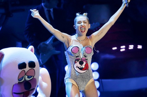
Here’s what we saw:

.

Afterwards, I don’t think any of us were quite sure exactly what had just happened to us.

It wasn’t just the raunchiness or the shock value. This is the VMA’s, after all, where Madonna kicked things off 30 years ago by dry humping the stage in a punk wedding dress; where Britney sang “I’m a Slave 4 u” while dancing in a green version of Cyrus’s flesh-toned 2-piece, with a live python draped around her body, and later where Madonna and Britney and Christina all made out, and then after that, where Lady Gaga hanged herself. The controversial VMA performance is now pretty much a traditional rite of passage in the transition from Disney child star into adult entertainer.

Wait… what?

Anyway, we expect this. We’re  practically inured to it at this point. But this show, Cyrus’s show, got under our skin. And not in, like, a good way.

“It seems everyone hated whatever it was Miley Cyrus was doing at last night’s VMAs,” Neetzan Zimmerman wrote on Gawker.

Whatever it was she was doing…. we couldn’t even be sure. The next morning we woke up in turns “stunned,” “shocked,” “outraged,” outraged by the outrage. From the moment Cyrus first stuck out her tongue, things felt weird. We’re so used to performers adhering to a strict code of conduct of media training — gliding through precise sequences of polished, camera-ready choreography. You want this to wind up being the image that follows you around the internet tomorrow, we thought to ourselves watching Cyrus gag.

Little did we know.

Then the performance began in earnest, Cyrus singing and dancing to her summer jam, “We Can’t Stop,” and we tried to relax. But 90 seconds in, as Jody Rosen writes on the Vulture blog, “pausing to spank and simulate analingus upon the ass of a thickly set African-American backup dancer, her act tipped over into what we may as well just call racism: a minstrel show routine whose ghoulishness was heightened by Cyrus’s madcap charisma.”

Awkward.

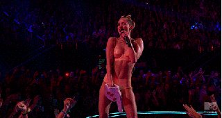
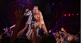
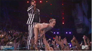
And that was all before Robin Thicke got onstage and Cyrus snapped out of her teddy-bear teddy, down to a nude, vinyl bikini, to duet Thicke’s own controversial summer hit, “Blurred Lines,” and the REALLY uncomfortable shit happened. The most disconcerting thing about their performance was Thicke’s consistent lack of….. engagement. While Cyrus twerked all over his body, Thicke seemed barely aware she was there. The New York Times described Cyrus’s behavior as a “molesting” of Robin Thicke. Behind his shades you couldn’t be sure whether he was even making eye contact. Of course, what Thicke was doing was reenacting the Blurred Lines video. Directed by Diane Martel, who’s also responsible for the video for We Can’t Stop, the video features basically completely naked women dancing next to, strutting past, facing away from, and engaging in a host of other activities that in general involve pretty much anything except actually acknowledging the presence of Robin Thicke. Or of T.I. or Pharrell Williams. The non-interactions between the fully-dressed men in the video and naked women seem so unaligned and asynchronous and non-sequitured they might as well be SnapChatting them in. “I directed the girls to look into the camera,” Martel explained on Grantland. “This is very intentional and they do it most of the time; they are in the power position. I wanted to deal with the misogynist, funny lyrics in a way where the girls were going to overpower the men. Look at Emily Ratajkowski’s performance; it’s very, very funny and subtly ridiculing. I find [the video] meta and playful.”

Whether the end result really succeeds in its intention is debatable (“Is meta-nudity a thing? Is there such thing as ‘ironic objectification?'” Callie Beusman asks on Jezebel), but this conceit at least makes sense in the context of a music video — and, by the way, subconsciously speaks to all of us and our modern experience of hyper-mediated, asynchronous connection. But you know where it doesn’t actually work? Live, on stage, as a visual to support a 20-year old former child star’s transformation into a woman claiming her sexuality.

“Performing near-nude on the VMA stage 10 years earlier,” Daniel D’addario writes on Salon.com, “Christina Aguilera was singing an ode to her own empowerment and desire to get sexual satisfaction on her own terms. Last night, Miley was singing a song about how good Robin Thicke is at sex.” And in this context, Thicke’s lack of engagement in the proceedings made Cyrus’s relentless hypersexualization look desperate, or worse yet, depraved. At first Cyrus came across like that girl you knew in college, drunk at a party, looking to fuck for validation. If you happened to stop to factor in the 16 year age difference between Thicke and Cyrus, a whole other kind of psychological issue could, conceivably, have seemed to be spilling itself out all over MTV. But the real cringe-worthy element of the experience was that, in the absence of active participation — and its implicit consent — from anyone sharing the stage with her, Cyrus’s agrosexual zeal very quickly began to look kinda….uhm…. predatory.

In one singular moment, Cyrus appeared to us as victim and predator. The violated, and the violator. No wonder we weren’t sure what we were even looking at. Cognitive dissonance, haaaaaaaay! Miley Cyrus had roofied us all. You could understand why, the next morning, MSNBC’s, Mika Brzezinski would call her “disturbed.”

Perhaps the problem is that “no one has apparently said ‘no’ [to Cyrus] for the last six months,” Jon Carmanica, suggested in The New York Times.

But it sure did  make for some great GIFs tho, amirite?!

ku-medium

ku-medium (2)

ku-medium (1)

From its very first steps, Cyrus’s performance felt, unmistakably, like watching a GIF happen in real-time. On the Atlantic, Nolan Feeney called this “the most GIFable award show ever,” and, indeed, Cyrus’s performance felt like the first one truly made for the age of the Internet. The act was speaking the native tongue — stuck all the way out — of the digital age, its direct appeal to meme culture as blatant and aggressive as the display of sexuality. All the performances before it had been made for TV. This show changed that. The source material and its inevitable meme-ification appeared to be happening simultaneously. The  Internet was inherently integrated within the performance. It was no longer a “second” screen; it was the same damn screen. If you go to watch the performance now on MTV.com, a bright pink button, set in stark relief against the site’s black background, blares, “GIF THIS!”

You want this to wind up being the image that follows you around the internet tomorrow? 

Yes. That was the whole point.

It’s our party we can do what we want
It’s our party we can say what we want
It’s our party we can love who we want
We can kiss who we want
We can sing what we want
– “We Can’t Stop

Six years before Cyrus was even born, a trio of dudes demanded you had to fight for your right to party. But that’s not what We Can’t Stop is is about. This song is a rallying cry for the right to be your own person. Something the human collateral of the Disney industrial complex, and the daughter of a Hollywood dad, would know something about, no doubt. (“It’s my mouth; I can say what I want to.”) But it’s also something that any adolescent can relate to, especially now.

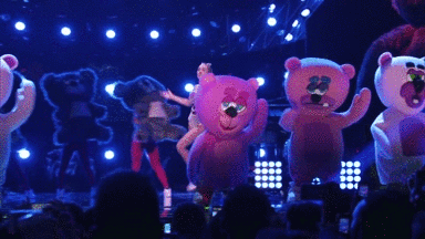
“It’s like a giant, fucked-up selfie,” Martel said, explaining the concept behind the “We Can’t Stop” video, on RollingStone.com. “She’s absolutely taking the piss out of being in a pop video.” Even if you haven’t had to shoulder the weight of a multi-million dollar entertainment franchise since you were a child, everyone growing up now is saddled with the responsibility of managing their mediated identities. So how do you rebel against that responsibility? How do you subvert the expectation to maintain your put-together, meticulously edited persona? Maybe you have a video of yourself doing a Salvia bong hit at a house party on your 18th birthday end up on TMZ. Maybe you fuck your image up. You don’t try to look good. You grimace and stick your tongue out and take a photo and post that fucked-up selfie for the world to see.

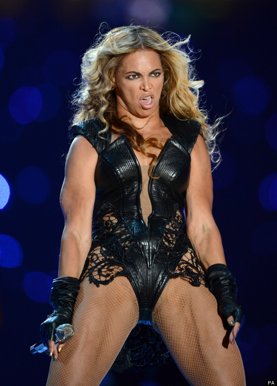
Because if you don’t do it on your terms, the Internet meme hive force will do it for you. Here’s a pic that made the Internet meme rounds in the wake of Beyonce’s Super Bowl performance earlier this year:

Superbowl XLVII - Baltimore Ravens v San Francisco 49ers  - Mercedes-Benz Superdome


And here’s Cyrus fucking the shot up on purpose, before you could do it to her:

ku-bigpic

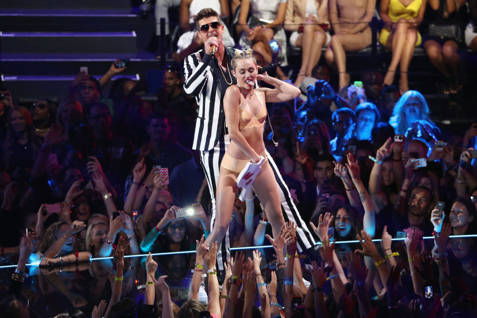
If you think Cyrus was trying to look good for you, if you think that no one was telling her “no” as she was putting the VMA performance together, that she herself wasn’t scrutinizing each frame of rehearsal video, and keenly understanding just how wrong it all looked, you’re completely missing the point.

We live in an age of violation. From News of the World hacking the cell phones of celebrities and bombing victims, to PRISM hacking everyone, everything, all the time. From doxxing to TMZ, from Wikileaks to Kiki Kannibal to Star Wars Kid to so many victims of online harassment driven to suicide, to Diana dying in a car crash in a French tunnel while being chased by paparazzi, to “Sad Keanu.”

The meme hive force is the digestive system of our networked world, capable of gleefully devouring its victims — or at least its objects — alive. Cyrus doing it to herself is “disturbed,” but the violating, exploiting meme hive force doing it to her is just another Tuesday on the Internet? And we’re totally cool with that. But, see, Cyrus thinks this is her song. And she can sing if she wants to. Her performance, crass, lewd, uncomfortable, disturbing, whatever, turned the hive force dynamic on its head. The meme object rolled out of a giant teddy bear, landed on stage and screamed, “GIF THIS!” It stuck its tongue out at all of us and belted, FIRST! at the top of its lungs and memed itself. Before anyone else could. The show got the upper hand by turning itself into the object of its own violation.

Because when we’ve already been titillated in every way imaginable, what else is there left to do? Cyrus basically didn’t do anything on the VMA stage that hasn’t been simulated there in one way or another before. So how else is there for a female pop star to traffic in her own sexuality in any new way, except to make us all feel like she was coercing us into violating her?

It was a new one for me. Was it weird for you, too?

“The Internet is fickle,” Martel said on Grantland, “But if a video is strong and entertaining, it is going to get massive hits, so of course strong work is going to have an effect on record sales. As I said, I’m mega-focused on selling records right now, so I’m doing that. I’m only taking jobs where this is a possibility. There is a new generation of kids that are overstimulated as viewers and you have to address that somehow. I’m just paying attention to the audience and their movements.”

What I learned from the 2013 VMAs is that owning your sexuality is passé, but owning meme culture by exploiting your sexuality is now. After all, in the attention economy, self-exploitation is self-empowerment. (Miley Cyrus spoiler alert: ad revenue).

Whatever you think of it, Cyrus’s performance was a deliberate reflection of where we are as culture. Calling it a “commentary” may be an overstatement, but it’s definitely a comment: 

R U NOT ENTERTAINED?????

942064_641_5YfeVAd


Oh, and guess what else? MTV, it turns out, still exists.


Subscribe for more like this.


Music & Mirrorgrams: Lessons Learned From Working in Apps

musicandmirrorgramsMirrorgram by: bobdoran


This weekend I was invited to a salon-style dinner organized by Tim Chang and Les Borsai, hosted at the home of Steve Rennie. The event turned out to be a fascinating gathering at the intersection of digital media, technology, and music.

I have an art app called Mirrorgram. We launched it last October, and just this past month we crossed a million users! But I ended up in apps kind of by accident. I come, as did nearly everyone at the dinner, from music. For a long time, I used to produce music festivals. I’ve worked with Live Nation and House of Blues, and for years I was the marketing director for the Do Lab on the Lightning in a Bottle Festival. That’s actually how I met my Mirrorgram co-founder, Justin Boreta, who’s part of a band called the Glitch Mob. In fact, he came up with the concept for Mirrorgram while on tour, during the hours spent bored on the bus between shows, nerding out with iPhone photo apps. And it was built by the team at StageBloc, whose platform is designed to specifically support the unique  content and community needs of musicians and performers. So when Tim asked me to come to the salon with a few minutes worth of lessons learned from working in apps, the first thing that came to mind for me was how much we draw on what we’ve internalized from our experiences in the music world to shape the way we approach what we do in the app world:

1. Fans vs. Users.
Before we ever started thinking about “users” our reference point was always “fans.” Of course, now we’re incredibly concerned with usability, and how people actually engage with our product, but beyond the app itself, we have a deep understanding and respect  for the importance of nurturing the kinds extended social narratives and interactions that get created around it. Like what happens with a band people love, or an annual music festival that they revisit every year. We’ve seen so many Mirrorgrammers create connections and forge friendships and even artistic collaborations with one another through this shared love that they have for the app, and the art they create with it. And we’ve always understood that drive through the lens of fandom.

2. Choose your own adventure.
Coming from a world of creating real-life experiences we have a natural inclination to approach what we’re doing in the digital space with that same sensibility. It’s about creating a platform with a certain amount of structure — a concert set list, a festival lineup, an app feature-set — but then also leaving a ton of room open people to create their own experiences within that structure. When we look at the kind of art that people create with Mirrorgram, it consistently blows us away. Half the time we don’t even know HOW people are creating the images they are with it. We’re just watching the feed, mesmerized. It’s pretty unbelievable. Coming from music, that experience of creating something and putting it out into the world and then seeing people take it into directions you could have never imagined or expected is very familiar.

3. More than the sum of its parts.
There’s something really interesting in approaching the evolution of an app, or any product, the way a band thinks about the new music it releases, or the way a music festival builds on what came before, year after year. A band doesn’t think about its next album like an “update.” It’s about a journey that we want to take our fans or our attendees or our users on with us. The day we went live with Mirrorgram, we referred to it (kinda jokingly, but kinda not) like the start of “The Symmetry Revolution.”

We still reference it in a tongue in cheek kind of way, but people in the iPhoneography world have really gravitated to that idea of it being about something bigger, of the app as an entry-point into a larger creative movement or community. To us, Mirrorgram has always been much more than just the sum of its features — it’s part of an ongoing, shared, cultural and aesthetic experience we’re creating and evolving together with the people who use it.

It’s still fairly early days for Mirrorgram, but hopefully you might want to come on that trip with us.

And thanks again to Tim, Les, and Steve, for hosting such a wonderful evening!


Subscribe for more like this.


Plan To Fail

fight-club_airlinesafety


This month’s Harvard Business review cover story, Strategy for Turbulent Times, explains how the pace of competitive change has reached an “inflection point.” Up until now the business world has been obsessed with the notion of building a sustainable competitive advantage — it is the idea at the core of strategy textbooks, of Warren Buffett’s investment strategy, and the successes many 20th century companies. But we are now living in a time where competitive advantage often evaporates in less than a year. As the article proclaims: “Sustainable competitive advantage is now the exception, not the rule. Transient advantage is the new normal.”

I was thinking about this article last Thursday when Instagram released a new update that now supports 15-second video sharing, a direct assault on Vine, Twitter’s app which came out just six months ago, and defined six-second video as a new content format. By Sunday there was already blood in the water.

Vine had dropped from No.2 to No.7 on the U.S. iPhone download chart of free apps in the wake of the new Instagram video update. Sunday was the first day since March 27th that Vine did not place in the top-5 most popular American iPhone apps. In another stronghold, Mexico, Vine dropped from No.3 to No.10 in three days. In its biggest European market, the United Kingdom, Vine dropped from No.5 to No.12. Globally, Vine placed in the top-10 iPhone downloads in 11 countries on Sunday. Down sharply from 34 countries last Thursday, and 29 countries just two weeks ago.

It all sort of begs the question: If Twitter had gone in with the assumption that Instagram would replicate this concept at the first opportunity, how would they have made Vine differently?

Would they have integrated the Vine functionality into the Twitter mobile experience directly rather than try to establish a new, external platform around a single utility? That, after all, is what Instagram did. Admittedly the jumble of video and photo content in the same feed is a bit foreign right now, but we acclimated to images and video in our Twitter feeds, and we’ll get accustomed to this all too quickly, too.

Twitter released a new product that introduced a novel content format disconnected from the mothership. Instagram said, thanks for doing the market testing for us, we’ll take it from here, and wove Insta-video into what they are as an app now.

It was either Benjamin Franklin or Winston Churchill who remarked in a prior century, “Plan to fail and fail to plan.” In the 21st century, the truism is now more accurately something like “Fail to plan to fail, and fail to plan….AND plan to  fail.”

What would you do differently today, if you knew your competitive advantage wouldn’t last tomorrow?


Subscribe for more like this.


UX In Advertising

This is where we are now:


In contrast, here’s what it looks like when technology ads rely on pushing the lingua franca of features instead of the native tongue of  *experience*:


The technology pervading our lives has brought with it a new colonizing language. Even the term “UX” has become mainstream enough within the cultural lexicon that it can now referenced explicitly, as in the new MySpace ad. But more importantly, we have evolved a shared vocabulary for technology that goes beyond the rudimentary terms of features and specifications. In the years since Apple first pioneered and perfected this approach, we have all become fluent in technology’s emotional language.

This split between the emotional and the rational appeals, between the experience and the specs, comes at an interesting time. As Millennials are notoriously buying fewer cars (“Even the proportion of teenagers with a [driver’s] license fell, by 28 percent, between 1998 and 2008,”) — the new technology that keeps us connected is now being sold like automobiles.


(Thanks to @ThomPulliam for pointing out the common theme.)


Subscribe for more like this.


“Web Design” Is Dead

ios7

One of my favorite of Steve Jobs’ quotes — if not THE favorite — is this:

People think it’s this veneer — that the designers are handed this box and told, ‘Make it look good!’ That’s not what we think design is. It’s not just what it looks like and feels like. Design is how it works.

It’s a sentiment echoed in the philosophy behind Apple’s completely rethought new design language for the forthcoming iOS7, just announced this week:

Nothing we’ve ever created has been designed just to look beautiful. That’s approaching the opportunity from the wrong end. Instead, as we reconsidered iOS, our purpose was to create an experience that was simpler, more useful, and more enjoyable — while building on the things people love about iOS. Ultimately, redesigning the way it works led us to redesign the way it looks. Because good design is design that’s in service of the experience.

This is not only a standard that Apple holds itself to, it now extends to all those who develop on the iOS platform with comprehensive guidelines on how third party developers should design for iOS 7 to match Apple’s own style. As TechCrunch puts it, “Developers will have to adapt their apps to match the rest of the operating system if they don’t want them to look antiquated.”

Here are Apple’s three main themes for developing for iOS 7:

Deference. The UI helps users understand and interact with the content, but never competes with it.

Clarity. Text is legible at every size, icons are precise and lucid, adornments are subtle and appropriate, and a sharpened focus on functionality motivates the design.

Depth. Visual layers and realistic motion heighten users’ delight and understanding.

On Apple’s list of  things app developers should do to get ready for iOS 7 are instructions like: “Revisit the use of drop shadows, gradients, and bezels. Because the iOS 7 aesthetic is smooth and layered—with much less emphasis on using visual effects to make UI elements look physical — you may want to rethink these effects.”

This kind of “smooth” digital design aesthetic, that rejects the skeuomorphism of making icons on a flat screen look like 3-dimensional, analog objects, has a name — “flat design.” And Apple was not even the first to adopt it. (They were the last holdout, in fact). Microsoft and Google got there first. Back in 2011, when Microsoft unveiled its “Metro” design language, now simply referred to as “Windows 8,”  its design principles were:

Clean, Light, Open and Fast

We took an approach that we call “Fierce Reduction” to remove any elements in the UI that we felt were unnecessary; both visual elements and feature bloat. It allows us to shine a focus on the primary tasks of the UI, and makes the UI feel smart, open, fast, and responsive.

Alive in Motion

The transitions between screens in a UI are as important the design of the screens themselves. Motion gives character to a UI, but also communicates the navigation system, which helps to improve usability.

Celebrate Typography

Our design inspiration is very typographic, and it felt like it was time for User Interfaces to be uncompromising about type as well. Type is information, type is beautiful.

Content, Not Chrome

It’s the content on the phone that people want, not the buttons. Reducing the visuals on the phone that aren’t content will help you create a more open UI, and it also promotes direct interaction with the content.

Authentically Digital

Finally, we believe in honesty in design. A user interface is created of pixels, so in Metro we try to avoid using the skeumorphic shading and glossiness used in some UI’s that try to mimic real world materials and objects.

 windows_8

With Apple joining the tech trifecta, (“Leading by following“), Flat Design has been transformed from a trend into a manifesto. It is a fundamental philosophical shift from what’s come before in what design’s role is in the natively digital experience.

Living in L.A. it’s very easy for all metaphors and analogies to get reduced to the automotive experience. So here we go — for a long time in the web, we had the same people, approaching in the same way, the design of something like this:

5GTDN13E378117608-1c


And something like this:

28332_original

I mean, we just didn’t know any better. We didn’t really grasp that we needed completely different types of design philosophies. All we knew was that things on the web had to…. look….. like something….. Maybe … something pretty?…. Or… Cool? Anyway, we had to get designers. To design them. And what visual arts genius was going to want to create a digital masterpiece that looks like they were barely there in the first place?


ios-7-ui-transition-guide_-layout-and-appearance

Orite…. Apple.

For many a designer — sadly, still — whatever the reason a user has come to the destination they are designing, it is second to the privilege of being exposed to the designer’s creative brilliance and superior taste.

Apple is saying, this is where we are as a culture: we’re past that now. Apple wants “designers” to get out the way. Users are not here to marvel at your “design.” They’re here to get to the shit your design is jumping up and down, waving its hands frantically trying to get attention, getting in the way of. Apple wants to make it very clear that the UI — that layer between the human, and the content that this human is trying to access, aka the “design” layer — is not the star. It should, quote, “play a supporting role.”

Commuters don’t care about your “creative vision.” They are just trying to get fucking home.

If you want to be Dali, you should probably not be a freeway designer. But if you want to design freeways — or iOS experiences — then your art is about making something sublimely useful, usable, and effective. This is what the companies defining the way we access the digital world all stand for now. This is what they believe makes for a beautiful experience on their devices and on their operating systems.

“Web design” is dead because everywhere the “design layer” of the web is being sandblasted off, the interface reduced down to its barest essence. This is why the new, natively digital design disciplines are found deep beyond the surface of aesthetics, in user experience design, in information architecture, in interaction design.

More than ever, Jobs’ words are true: design is now a fundamentally inextricable part of how it works.

There’s simply not much room left for anything else.

And if you think you’ll at least get to choose the colors based on your personal design taste…. like Apple says, “you may want to rethink” that as well.

From Fast Company’s “The Science Behind Colors in Marketing“:

“Green connotes ideas like “natural” and “environment,” and given its wide use in traffic lights, suggests the idea of “go” or forward movement. The color red, on the other hand, is often thought to communicate excitement, passion, blood, and warning. It is also used as the color for stopping at traffic lights. Red is also known to be eye-catching.”

So, clearly an A/B test between green and red would result in green, the more friendly color. At least that was their guess. Here is what their experiment looked like:

3009317-inline-inline-4-why-is-facebook-blue-the-science-behind-colors-in-marketing

The red button outperformed the green button by 21%.

What’s most important to consider is that nothing else was changed at all: 21% more people clicked on the red button than on the green button. Everything else on the pages was the same, so it was only the button color that made this difference.


Subscribe for more like this.