UX Cruelty

Don’t blame it on the algorithm — assuming you’re designing experiences for “happy, upbeat, good-life users” might make you a terrible person.


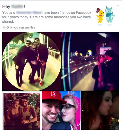
My friend is going through a divorce. Like nearly 5 million other Americans. And recently Facebook greeted her with this careless user experience:

IMG_3473
 

When this UX intrusion happened to her, it reminded me of a similar, psychological violation I’d read about four months earlier. That post, by Eric Meyer, had begun:

I didn’t go looking for grief this afternoon, but it found me anyway, and I have designers and programmers to thank for it. In this case, the designers and programmers are somewhere at Facebook.

I know they’re probably pretty proud of the work that went into the “Year in Review” app they designed and developed, and deservedly so—a lot of people have used it to share the highlights of their years. Knowing what kind of year I’d had, though, I avoided making one of my own. I kept seeing them pop up in my feed, created by others, almost all of them with the default caption, “It’s been a great year! Thanks for being a part of it.”  Which was, by itself, jarring enough, the idea that any year I was part of could be described as great.

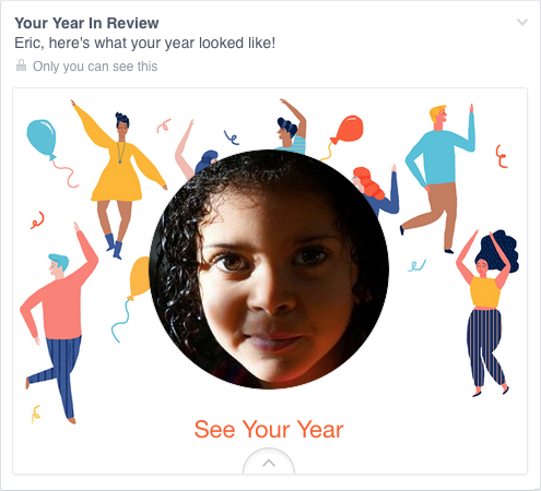
Still, they were easy enough to pass over, and I did.  Until today, when I got this in my feed, exhorting me to create one of my own.  “Eric, here’s what your year looked like!”

fb-year
 

A picture of my daughter, who is dead.  Who died this year.

Yes, my year looked like that.  True enough.  My year looked like the now-absent face of my little girl.  It was still unkind to remind me so forcefully.

I remember first reading this post the day it was published, Christmas eve 2014. When I went to look it up after my friend’s own violation by a Facebook app module I was surprised to (re)discover that it had been titled, generously, “Inadvertent algorithmic cruelty:”

And I know, of course, that this is not a deliberate assault.  This inadvertent algorithmic cruelty is the result of code that works in the overwhelming majority of cases, reminding people of the awesomeness of their years, showing them selfies at a party or whale spouts from sailing boats or the marina outside their vacation house.

But for those of us who lived through the death of loved ones, or spent extended time in the hospital, or were hit by divorce or losing a job or any one of a hundred crises, we might not want another look at this past year.

To show me Rebecca’s face and say “Here’s what your year looked like!” is jarring.  It feels wrong, and coming from an actual person, it would be wrong. Coming from code, it’s just unfortunate.


But of course, it did come from an actual person. “[The app] was awesome for a lot of people,” the product manager for Facebook’s Year in Review app, Jonathan Gheller, later told The Washington Post. Like all the digital experiences with, and within, which we all increasingly live our lives, an actual person — in fact a whole team of people — was responsible for concepting, designing, building, testing, and iterating this experience. No doubt, the responsibility for the rollout of this particular app featured prominently in a number of Facebook employees’ job performance reviews. From start to finish, this experience was crafted by people (not code). Calling its end result “inadvertent algorithmic cruelty” is like describing a drunk driving accident as “inadvertent gasoline cruelty.” For sure, it could have been avoided with an empty gas tank, but is that really the most accurate way to ascribe accountability in this situation? (Don’t blame it on the algohol).

“In creating this Year in Review app, there wasn’t enough thought given to cases like mine, or anyone who had a bad year,” Meyer wrote. “If I could fix one thing about our industry, just one thing, it would be that: to increase awareness of and consideration for the failure modes, the edge cases, the worst-case scenarios.”

If I could fix one thing about our industry, it would be to destroy the idea that these scenarios are edge cases.

Last year in the US, 2.6 million people died, leaving behind untold numbers of Facebook users who mourn the absence of their loved ones.

Right now 8.5 million people can’t find a job;

14.5 million people have cancer;

16 million people suffer from depression;

23.5 million people are addicted to alcohol and drugs;

45 million people live below the poverty line (including 16 million children)

These are not “edge cases.” These are not “worst case scenarios.” These are all people who use Facebook. And that’s not even counting your run of the mill disappointments, broken hearts, and inevitable wrongs and slights and meannesses that are, basically, life.

“The design [of the Year in Review app] is for the ideal user, the happy, upbeat, good-life user,” Meyer wrote. But if you are a product manager or UX designer creating experiences that will afflict affect hundreds of millions of people and you are only designing for an “ideal user”… at best that’s just lazy, and at worst — it’s creating LITERAL suffering.

Put another way:

Screen Shot 2015-04-16 at 7.40.34 PM

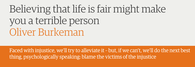
As Oliver Burkeman writes in The Guardian:

The world, obviously, is a manifestly unjust place: people are always meeting fates they didn’t deserve, or not receiving rewards they did deserve for hard work or virtuous behaviour. Yet several decades of research have established that our need to believe otherwise runs deep.

Confronted with an atrocity they otherwise can’t explain, people become slightly more likely, on average, to believe that the victims must have brought it on themselves. Hence the finding, in a 2009 study, that Holocaust memorials can increase antisemitism. Or that reading about the eye-popping state of economic inequality could make you less likely to support politicians who want to do something about it. These are among numerous unsettling implications of the “just-world hypothesis”, a psychological bias explored in a new essay by Nicholas Hune-Brown at Hazlitt.

If we didn’t all believe that [things happen for a reason] to some degree, life would be an intolerably chaotic and terrifying nightmare in which effort and payback were utterly unrelated, and there was no point planning for the future, saving money for retirement or doing anything else in hope of eventual reward. We’d go mad.

Yet, ironically, this desire to believe that things happen for a reason leads to the kinds of positions that help entrench injustice instead of reducing it.

Much in the same way that the “just world” cognitive bias can actually lead us to make crueler decisions, designing product features with the “happy, upbeat, good-life” ideal user bias can lead us to create crueler user experiences.

“To shield ourselves psychologically from the terrifying thought that the world is full of innocent people suffering,” Burkeman writes, we, as humans, “endorse policies more likely to make that suffering worse.” And by denying the full spectrum of the realities of people’s lives, awesome and tragic, we, as experience designers, do the same. Except we’re the ones with the power to actually do something about it.

“Just to pick two obvious fixes,” Meyer wrote at the end of his post, “First, don’t pre-fill a picture until you’re sure the user actually wants to see pictures from their year.  And second, instead of pushing the app at people, maybe ask them if they’d like to try a preview—just a simple yes or no.  If they say no, ask if they want to be asked again later, or never again. And then, of course, honor their choices. This is… designing for crisis, or maybe a better term is empathetic design.”

Or how about just, you know, design.

In the wake of Meyer’s post, the product manager for Facebook’s Year in Review app told The Washington Post. “We can do better.”

But four months later, Facebook’s photo collage assault on my friend suggests perhaps they don’t really think they can.

“Faced with evidence of injustice, we’ll certainly try to alleviate it if we can,” Burkeman wrote, “But, if we feel powerless to make things right, we’ll do the next best thing, psychologically speaking: we’ll convince ourselves that the world isn’t so unjust after all.”


Subscribe for more like this.


Hello, SparkMode!

Created by The Glitch Mob’s Justin Boreta, and BRIGHT, Inc., SparkMode is the first artist-owned app that lets you create, edit, & share digital art and design your own custom art products, from prints to decor, and beyond…


Gif2-Justin
 

tagline
.
Get the free app.
 download-on-the-app-store-button


.

You may have noticed the crickets here at Social-Creature for most of 2014 (eeesh 160x160x85-see-no-evil-monkey.png.pagespeed.ic.dCoZ8IyrSj). I was a little bit busy. Justin Boreta and I were cooking up a new creative project, called SparkMode.

If you haven’t been to a music festival recently, Boreta is —

thisguy

We’ve made some things together before that you’ve watched and clicked and played with. SparkMode is the next step in the evolution of Mirrorgram, an app we launched in the Fall of 2012. More than 2.5 million people created 10 million pieces of digital art with the app, igniting a pop aesthetic that took over music, fashion, and advertising for a bit.

But since those early days when the idea for Mirrorgram was first conceived (on the Glitch Mob tour bus; rock ‘n roll \m/), a lot has changed….


The iPhone has completely revolutionized how we make art.


You and I take this for granted now, but it’s become insanely easy to make art. It used to require really complicated image editing software, and the whole learning curve that came with it. And before computers, you needed years of training and practice to get your creative skills to match your artistic intent.

Now, you can get an app that’ll let you create cool stuff with a few taps in seconds. It’s a totally new relationship to the process of making art. It’s simple, it’s effortless, it’s fun. It’s an instant jump from inspiration to execution.

But why stop at the screen?

As Boreta says, “I love the feeling of getting art made into tangible things you can feel with your hands.”

IMG_2458

SparkMode allows you to create art with app simplicity in a new medium — physical space.

In SparkMode you can layer multiple image effects to create kaleidoscopic patterns, trippy, abstract art, and beautifully symmetrical photo edits; and you can design physical art to make your offline world more beautiful, too. Order your creations through the app, and get them shipped to you anywhere in the world. We’re starting with canvas art, stickerbooks, and prints, and plan to expand into new creative mediums in 2015.

.

BRIGHT, Inc. makes products, experiences, and brands people love. Find out more: brightincorporated.com

.

  • Product Strategy & Roadmapping
  • UX Strategy: Mobile, E-commerce, Web
  • Growth, Community, & CRM Strategy
  • Brand Strategy
  • Content Strategy
  • Multi-Channel Communications Planning

.


Subscribe for more like this.


Modern Millennial

modernmillennial

If you live in LA, you should go to the Modern Millennial exhibit. As soon as you possibly can, too, cuz it’s over in 6 days. I’ll explain where and how to find it in a minute, but first I want to tell you what it is.

Modern Millennial is an art installation / existential performance art piece / media experiment in the spirt of Exit Through The Gift Shop / I’m Still Here, except the theme is about being a person going through the modern experience.

af458d32425ebbd73a9ced27574b36ab_large

Modern Millennial began with a Kickstarter.

Obviously.

The project was funded, and the exhibit installed, so now what’s happening is during the month of September a dude named Moses Storm is living inside an art exhibit in an industrial loft in #DTLA. The loft is filled throughout with installations that comprise the Modern Millennial exhibit, and Storm, the eponymous modern millennial, living life in said loft, is himself an interactive installation as well. It’s funny and weird and smart and awesome.

Modern Millennial seems, at first, like it will be a lampoon of millennial clichés — and it is definitely that — but it’s also something so much more interesting and introspective and sincere in the process.

“The Modern Millennial,” proclaims the Kickstarer, “Is a game-changing form of immersive performance art in which roaming audiences experience epic insights into a generation.”

But, of course, Millennials are already the most poked, prodded, packaged, positioned, market-tested, focus grouped, classified, and stereotyped generation in history. And of course, the buying and selling of ourselves to ourselves is already part of our Millennial experience, and each of us in the attendee target audience is a full-time object in our own, modern media experiment.

Of course, that’s part of the point. The art and the artist are both keenly aware they are the results of the same generational forces they are ridiculing.

Or maybe not ridiculing at all.

There are, in a sense, three phases to the Modern Millennial exhibit. First, there is the digital precursor that you encounter before  the physical space of the show. Then there is the in-person experience of the exhibit itself. And finally there is the digital afterlife of the exhibit, living on through shared photo content and hashtag feeds. Each of these three aspects comes with its own distinct tone and role in the narrative arc of the Modern Millennial experience, and likewise, the modern millennial experience.


Phase 1.

Google “Modern Millennial” and the first thing you’ll find is the Kickstarter.


A typical cocktail of narcissism, hype, and jargon, it’s also unmistakably meta: taking its absurd premise seriously while also mocking itself, Millennials, (Kickstarer campaigns), everything:

Our goal with this piece is to show a different side of Millennials. And prove that not all of us are lazy narcissist who are just looking for a handout.

Some cool stuff happens if we hit our stretch goals.

If reached, we will tour with the exhibit. I am thinking Paris!

d72dd9f5b25938b5dd2058905cbae978_large


Phase 2.

But in the physical space of the exhibit, the the mood is notably different. It’s exposed, honest, intimate. The way things look online is not how they feel in person.

Obviously.

nimblewill
@nimblewill


morganisethnic
@morganisthenic


The cynicism and detachment of digital distance break down into vulnerability and sincerity in physical space. So many of the pieces are an exploration of existential yearning for meaning and connection.

10655043_679790918767878_1959917424_n@babiejenks


?
@iamstevienelson


actressamanda
@actressamanda


shelbyfero
@shelbyfero


radojcich
@radojcich


The Wall of Activism, for example, is a usual suspects lineup of viral sincerity eruptions.

snowcone88
@snowcone88


It’s impossible not to view a LiveStrong Bracelet, a Stop Kony poster, a bucket full of ice water (among others), with a cynical side-eye. But when you see them displayed this way, all cataloged together, they are also inescapably earnest. These recurring, massive social hysterias of optimism and the dream of collective empowerment; this ceaseless desire to care.

The most popular piece in the show (based on frequency of Instagram appearances) is also the most inscrutable.


skiparnold
@skiparnold


Is it a comment about being unafraid to come out as an artist?  To claim a sincere artist identity in the midst of a storm of irony?


hoorayjen
@hoorayjen


Or is it a jab at the pretentiousness of the concept? An ironic joke about such an analog anachronism?


kmahair
@kmahair


Does such a thing as a “serious artist” still even exist, or is the popularity of the piece akin to that of an endangered animal on display at the zoo?


peterhinz
@peterhinz

Is it for real, or is it a joke?


taysprizzle
@taysprizzle


Does it matter?


 alimerlina
@alimerlina


Phase 3.

For an exhibit titled, #ModernMillennial, the show itself is remarkably, unremarkably lo-fi. The Modern Millennial is less infatuated with technology than with humanity. And yet the experience is inherently hybridized with digital DNA.

Obviously.

babiejenks1
@babiejenks


In 2014, our digital technology is increasingly hurtling towards pervasive invisibility, insinuating itself into our every waking moment with the banal inevitability of electricity. And yet, it’s the human interactions with the art pieces, through the lens of digital media, that turn them on like a switch. Without Instagram, or at the very least the vernacular of Instagram, much of Modern Millennial wouldn’t really make any sense.

“Stand Here Do Nothing” is built to basically only really work once it’s in a photo you’ve posted up somewhere:

lucifergoosifer
@lucifergoosifer


gardenofart_
@gardenofart_


Likewise, “Like This So I know You Still Exist.”

erikaheidewald
@erikaheidewald


danielcarberry
@danielcarberry


Taking and posting these photos is at once  a cliché and an act of participating in a piece of art about a cliché.

emilyfaye2
@emilyfaye2

But it’s ok. Don’t worry. You can’t help it. This stereotypical experience — it’s universal.


@cassydbadiiiiiiiie
 

Modern Millennial sincerely delivers on what its ironic (or not) Kickstarter promised: it captures the truths our contemporary condition. And it does so with humor and humanity. There’s certainly plenty to mock about the times we live in, but we’ve got to have compassion for our predicament, too.

Obviously.

babiejenks2@babiejenks


How to get to the Modern Millennial Exhibit.

In a time where basically everything is accessible online, the show is almost stringently unfindable. You stumble into it like a niche forum from the ’90s. We used to discover things online. Now the only way to access a real sense of discovery is through things hidden offline. So go:


tumblr_nc1evosRox1smq2c7o1_1280


Subscribe for more like this.


Make More Ads Like This

It’s not that fucking hard.


Yesterday I was served this ad as the pre-roll in front of a TLC music video on YouTube and kind of freaked out. It was such a profound departure from the typical ad aimed at women, it felt like I’d seen a unicorn. I then proceeded to devote way too much of my day trying to find it afterwards. I reloaded “Creep” at least 50 times to try to get the same ad again. I finally ended up tweeting at @SecretDeodorant to help me track it down. (Thanks, Secret!)

“Did you know, striking a confident pose for 2 minutes can leave you feeling fearless all day?”

Did you know that this is actually true?


As social psychologist, Ann Cuddy, explains in her Ted talk, this is actually true whether you believe it or not! Our body language affects not only how others see us, but it can also change how we see ourselves. She goes on to show how “power posing” — standing in a posture of confidence, even when we don’t feel confident — can alter testosterone and cortisol levels in the brain (all things that affect perspiration, by the way) and may even have an impact on our chances for success.

When people feel happy they smile, but conversely, holding a pen between your teeth, which forces the facial muscles into a smile, will actually make you feel happier. So you can stand there doing the “Wonder Woman” and feel silly the whole time you’re doing it and it doesn’t even matter. Our minds change our bodies, and likewise, our bodies can change our minds. Posture can become power. For a product so intimately tied to the mind-body connection, this message is a no-brainer.

Oh, hey, sup, creative directors and brand managers: MAKE MORE ADS LIKE THAT.

Make less ads like this:


You can either have your intended target associate your brand with a message that depicts them as clowns, and experiences that make them feel foolish — the kinds of things we all try to avoid, forget, and deny. Or you can associate your brand with experiences that LITERALLY make people feel assertive, confident, and powerful — a sensation we all crave like a drug fix, and cling to with all our might in the face of an uncertain world.

The choice is not that fucking hard.


Subscribe for more like this.