Writing about the aftermath of the public outcry against Tropicana’s packaging redesign earlier this year, which ultimately led to the OJ cartons reverting back to the original art, I mentioned Mountain Dew’s “Dewmocracy” campaign — an interactive, story-based online game which resulted in 3 new Dew flavors designed and developed virtually entirely by fans.
Now that there’s a buzz about Tropicana’s openness to fan-feedback in general, and about its packaging design in particular, why not create a platform for people to submit their design ideas? How might Tropicana lovers re-envision what that OJ carton could look like given the chance? In fact, why pick just one new design? How about different winning carton designs printed in “limited editions”? Why not deliberately set out to discover and promote emerging artists, giving them their first break of mass exposure through orange juice cartons in grocery stores across the country? If it’s art, suddenly there’s a whole new reason for choosing one OJ brand over another. It’s not just about a “campaign,” it’s an opportunity to create culture.
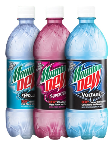
Mountain Dew, it seems, has already been putting this exact idea to work, (of course). Similar to Evian’s partnership with famed designers like Christian Lacroix, Jean Paul Gaultier, and Paul Smith, Mountain Dew has rolled out the third installment of their limited edition artist bottles under the Green Label Art series.
With these aluminum canvases, Mountain Dew not only taps into the urban indie art culture by supporting artists Claw Money (NY), Jeff McMillan (LBC), Nathan Cabrera (LA), Pushead (SF), Stephen Bliss (NY), UPSO (Toledo!), and Evan Coburn (LA), it also moves the Pepsi beverage deeper into lifestyle brand territory. There is also more artwork to check out, as well as computer wallpapers from each artist to download on the Green Label Art site. Plus, I’ve seen these new bottles over the weekend, and they’re pretty damn cool-looking, for only slightly (less than a dollar) more than a regular soda bottle. Super smart.
Now that there’s a buzz about Tropicana’s openness to fan-feedback in general, and about its packaging design in particular, why not create a platform for people to submit their design ideas? How might Tropicana lovers re-envision what that OJ carton could look like given the chance? In fact, why pick just one new design? How about different winning carton designs printed in “limited editions”? Why not deliberately set out to discover and promote emerging artists, giving them their first break of mass exposure through orange juice cartons in grocery stores across the country? If it’s art, suddenly there’s a whole new reason for choosing one OJ brand over another. It’s not just about a “campaign,” it’s an opportunity to create culture.
And now I’m discovering that Evian has been onto something very similar for years already, (Thanks, John), giving a whole new meaning to the term “Designer Water.”
Partnering with famed designers, Evian has been creating special, limited edition “Prêt-à-Porter” bottles which sell for upwards of $13 a pop, designed by the likes of Christian Lacroix (2008):
In case you happen to have missed it, Tropicana changed the design on their cartons last month, and in the process discovered that “Some Buyers Are Passionate About Packaging,” as Stuart Elliott writes in the New York Times:
PepsiCo is bowing to public demand and scrapping the changes made to a flagship product, Tropicana Pure Premium orange juice. Redesigned packaging that was introduced in early January is being discontinued, executives plan to announce on Monday, and the previous version will be brought back in the next month.
Also returning will be the longtime Tropicana brand symbol, an orange from which a straw protrudes. The symbol, meant to evoke fresh taste, had been supplanted on the new packages by a glass of orange juice.
The about-face comes after consumers complained about the makeover in letters, e-mail messages and telephone calls and clamored for a return of the original look.
Some of those commenting described the new packaging as “ugly” or “stupid,” and resembling “a generic bargain brand” or a “store brand.”
“Do any of these package-design people actually shop for orange juice?” the writer of one e-mail message asked rhetorically. “Because I do, and the new cartons stink.”
Others described the redesign as making it more difficult to distinguish among the varieties of Tropicana or differentiate Tropicana from other orange juices.
Such attention is becoming increasingly common as interactive technologies enable consumers to rapidly convey opinions to marketers.
It was not the volume of the outcries that led to the corporate change of heart, Mr. Campbell, [president at Tropicana North America in Chicago] said, because “it was a fraction of a percent of the people who buy the product.”
Rather, the criticism is being heeded because it came, Mr. Campbell said in a telephone interview on Friday, from some of “our most loyal consumers.”
“We underestimated the deep emotional bond” they had with the original packaging, he added. “Those consumers are very important to us, so we responded…. What we didn’t get was the passion this very loyal small group of consumers have. That wasn’t something that came out in the research.”
What has essentially happened here is that the ultimate fallout from the responses of a “very loyal small group of consumers” has exponentially magnified the exposure for what was originally just your run-of-the-mill packaging redesign:
The campaign, which carries the theme “Squeeze it’s a natural,” was created by Arnell in New York, part of the Omnicom Group. Arnell also created the new version of the Tropicana packaging.
“Tropicana is doing exactly what they should be doing,” Peter Arnell, chairman and chief creative officer at Arnell, said in a separate telephone interview on Friday.
“I’m incredibly surprised by the reaction,” he added, referring to the complaints about his agency’s design work, but “I’m glad Tropicana is getting this kind of attention.”
That’s the thing. Because of this vocal minority of avid Tropicana fans the attention of a far wider audience has been captured. Tropicana has now made a bigger splash by announcing they will be changing the packaging design back, than they did by changing it in the first place. Suddenly the avid Tropicana-fan minority has company.
Suddenly a lot more of us are now talking about orange juice. Thinking about orange juice! And thinking about it in a way that we never did before. After all, for the vast majority of us, just how different is one OJ brand from another? It’s not exactly a lifestyle product category, is it? (The whole organic argument aside for the moment, as it isn’t really specific to orange juice in particular so much as to grocery purchases in general). Do most of us really think about purchasing Tropicana vs. Florida’s Natural vs. Minute Maid because one brand is more relevant to our identity than the others? Unlikely.
So after enjoying its moment of unique distinction, Tropicana is now planning to scrap the new packaging and bring back the old familiar design so that the small loyal group who asked for it can be appeased, and all the rest of us can go back to not caring about orange juice.
But what if you could do something different?
What if discovering that your brand has more deeply passionate consumers than you’d imagined, and being open to to their input and responding to their concerns is just one part of the new marketing equation? What if the other part is understanding when you have an opportunity to get people really engaged. And not just engaged in giving you feedback, but engaged in helping to develop the brand’s identity itself. What if a non-lifestyle product category suddenly had the opportunity to stake out a piece of the cultural landscape? After all, Tropicana spent $35 million on the “Squeeze” campaign Arnell developed, which it now has to partially undo. What other direction could future advertising money be invested towards?
Having worked with various music festivals, I’ve consulted on and helped execute a number of “Battle of the Bands” contests. A proto-“User Generated Content” initiative, it’s always exceedingly popular. Different music acts submit tracks, or sometimes videos, competing for a chance to perform at the festival. This kind of initiative is most effective when combined with a voting aspect, so that it can extend beyond just the music acts, and actually get greater swaths of fans to participate in the process of selecting the winner to be added to the festival lineup.
In a more beverage-oriented variation on this theme, there’s last year’s “DEWmocracy” campaign, which allowed fans to vote on the new flavors for Mountain Dew (incidentally, also owned by PepsiCo), including the product packaging:
According to the PepsiCo press release, “DEWmocracy is the first-ever interactive, story-based online game that will result in a consumer-generated beverage innovation.” The campaign, which consisted of several phases, involved the launch of a website with a massive multi-player game. Once users created a profile they could go into the game’s 7 “worlds,” earning points and selecting different attributes for their ideal Mountain Dew beverage–i.e. flavor, “boost”, color, name, logo design, and so on. On top of all of this, the game/campaign had quite the storyline. As BevReview explains:
Pepsi and ad agency WhittmanHart Interactive tapped into actor/director Forest Whitaker to help craft the storyline. The entire adventure is setup up via a 3 minute short film that evokes overtones of Big Brother and overbearing governmental/corporate control. This has resulted in a loss of creativity….As is the plotline in most of these types of stories, a “chosen one” rises up to rebel against this oppression. Here’s the product twist… he seeks an elixir that will bring creativity and “restore the soul of mankind.” Now if you move beyond the irony that PepsiCo is a huge multinational conglomerate and that Mountain Dew is a top 5 selling soft drink found pretty much everywhere, you can see the somewhat unique spin this campaign possesses.
Not that I’m suggesting something this over-the-top is really appropriate for orange juice, necessarily, but the DEWmocracy site did reportedly have over 700,000 unique visitors, with 200,000 registered users participating in the first phase of the game. And that’s when they had to stir up consumer interest in engaging with the process of defining a brand direction for the Mountain Dew brand from scratch. Tropicana’s already got that one in the bag.
So what could you do if you were Tropicana?
Now that there’s already quite the buzz about Tropicana’s openness to fan-feedback in general, and about its packaging design in particular, why not create a platform for people to submit their design ideas? Yes, ok, clearly they discovered that people are deeply connected to the original design, but that is in response to just one other, radically departing, yet not particularly dynamic option. How might Tropicana lovers re-envision what that OJ carton could look like given the chance? It could just be a fun exercise in creativity, but then why not consider the possibility that the new design direction could emerge from the fans? Perhaps some new designs would remix the beloved orange-with-a-straw-poking-out image, but put a new spin on it with additional design elements or layers. Perhaps others would reinterpret the iconic image in totally new ways. Maybe others would find new ways to recreate the Tropicana logo in an unexpected style. Who knows?
What is definitely certain is that a small group of avid Tropicana fans clearly have deeply feelings about the brand and its design, and that a whole lot greater audience now cares that Tropicana cares about their input. So why stop the train there? Why not see how far it can go? In fact, why pick just one new design? How about different winning carton designs printed in “limited editions”? If it’s art, suddenly there’s a WHOLE new reason for choosing one OJ brand over another. In that case, why not deliberately set out to discover and promote emerging artists? Giving them their first break of mass exposure through orange juice cartons in grocery stores across the country. Nike’s doing it. So has Mountain Dew, for that matter. Suddenly it’s not just about a “campaign,” it’s an opportunity to create culture.
It’s like that scene in the Mad Men pilot episode where Don Draper suddenly realizes that if all the cigarette companies are facing the same limitations on what claims they can make in their advertising, then it’s “The greatest advertising opportunity since the invention of cereal.” When you’ve got a bunch of pretty much identical companies, making a pretty much identical product–in this case, OJ–you can do anything you want to create distinction. The possibilities for what you could do are pretty limitless, if you were Tropicana.
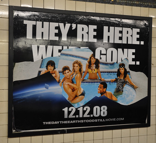
This is tripping me out. I was just going to write a quick post about how terrifically lame I think the outdoor ads for The Day The Earth Stood Still are. It’s basically just a stock-photo image of the Earth’s curvature, against a black outer-space backdrop, with big, block-y, white letters that read: “THEY’RE HERE. WE’RE GONE.”
I keep envisioning some situation where it’s like, they actually had some really kick-ass, slick-style design, and a tag-line that wasn’t written by Tarzan, but it was so high-concept and mind-blowing that it got stuck in endless rounds of focus groups, and approvals and whatnot, and as everyone was scrambling around, the deadline to get the final ad design to wherever it is that billboards and bus-wraps get printed was fast approaching, until it was only, like, minutes away, and finally some executive at 20th Century Fox got some assistant to open up MS-Paint and just slap the thing together, and clicked “Send.”
It’s so unimaginative and uninspired, and so blatant its sheer simplicity actually makes it totally meaningless. 1996 called, it wants its rejected Independence Day poster design back. In fact, so do I Robot, I am Legend, and a bunch of other future/apocalypse Will Smith movies. For that matter, every aliens/robots/zombies/mutants/monsters movie, ever, does too. At a time when our options for global crisis threats could not feel any less extra-terrestrial or non man-made, this just seems so irrelevant. Especially for a movie where the alien looks and talks exactly like Keanu Reeves, and says totally climate-crisis-compliant stuff like, “If the Earth dies, you die. If you die, the Earth survives.”
There! Look! That could have been such a better tag-line. I mean, anything could, really.
This ad is such a boring disaster that no one has even bothered to take a photo of it, or scan it or upload it or anything. It’s actually almost impossible to find any image of its lameness online anywhere.

 Now that there’s a buzz about Tropicana’s openness to fan-feedback in general, and about its packaging design in particular, why not create a platform for people to submit their design ideas? How might Tropicana lovers re-envision what that OJ carton could look like given the chance? In fact, why pick just one new design? How about different winning carton designs printed in “limited editions”? Why not deliberately set out to discover and promote emerging artists, giving them their first break of mass exposure through orange juice cartons in grocery stores across the country? If it’s art, suddenly there’s a whole new reason for choosing one OJ brand over another. It’s not just about a “campaign,” it’s an opportunity to


 the longtime Tropicana brand symbol, an orange from which a straw protrudes. The symbol, meant to evoke fresh taste, had been supplanted on the new packages by a glass of orange juice.