
after mentioning him in the previous post, i ended up going on what can only be described as an eddie izzard bender.
a self-identified “male lesbian,” and “action transvestite” (you know… “running, jumping, climbing trees… putting on makeup while you’re up there”: action transvestite), izzard is also fluent enough in english and french to do standup in both. so clearly the man understands a thing or two about the intricacies of hybridity and cross-cultural communication–phenomena that likewise are pretty fascinating for me.
i first saw dress to kill in 2002, and what forever earned my respect for izzard’s genius is when, during the encore, he actually performs a bit in french and manages to get everyone in the audience–and me watching–laughing hysterically. i don’t know french. neither does most of the rest of the english-speaking, san francisco audience where the show was recorded. yet in a feat of linguistic alchemy he somehow is able to completely pull it off. we’re watching him in a different language, and we totally get it. it’s such a bewildering display of how little a language barrier might actually matter in the process of understanding people who are unlike us that it feels like you’ve just witnessed a magician perform rather than a comic.
so somewhere in the course of the haze induced by binge consumption of every glorious, sexie, eddie izzard clip on youtube last weekend, i stumbled onto his website. i’m not entirely sure i remember how i got there, but i do remember flashes of what happened after. (note: this will be way funnier if you’ve actually seen eddie’s shows. since i had just watched several years of them before i arrived at the site, it was completely hilarious to me.)
when i went to sign up for eddie’s email list, i was faced with the following options:
Send me news and info about Eddie via Email
Only send me gig & appearance emails for my chosen country
Cake OR Death
when was the last time you were asked THAT before joining a mailing list?
and furthermore, what’s a nav. section called ![]() gonna lead you to?
gonna lead you to?
click on it and an audio clip of izzard’s voice admits, “well, it was the pressy-makey-doey-things page…but that didn’t really fit it.”
maybe you might want to pressy-makey-doey up on eddie’s sexie fridge…
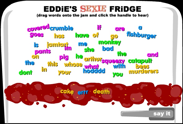
…where you drag words eddie utters during his show onto the jam smear on the fridge and then play them back to hear him say customized nonsense. (“jamtart arthur squeezy fishburger murderers catapult” is a good one).
but let’s back up for a second. maybe you’ve never seen eddie’s standup. maybe you came here because you’ve seen eddie in a movie, or on his TV show, the riches, and you’re trying to find out more about that. then you want the ![]() page. and when you click on it, eddie’s relentless, adlibbing audio which follows you around–as in real life so on the internet–announces in a tone of sophistication, “this is the acting page. it is a very serious page.” it, in fact, does look very serious. with a vogue-y black and white glamour shot of izzard. but when you look in the corner there’s a little purple beehive just below eddie’s face with bees buzzing all around it. drag your cursor over to it to find out what the hell that’s all about, and your mouse gets covered in bees!
page. and when you click on it, eddie’s relentless, adlibbing audio which follows you around–as in real life so on the internet–announces in a tone of sophistication, “this is the acting page. it is a very serious page.” it, in fact, does look very serious. with a vogue-y black and white glamour shot of izzard. but when you look in the corner there’s a little purple beehive just below eddie’s face with bees buzzing all around it. drag your cursor over to it to find out what the hell that’s all about, and your mouse gets covered in bees!
you may have seen glorious. you may not. you may think that’s hilarious. you may not. but either way, at least there’s something different going on here. something unexpected. and it’s not some kind of slick design-gasm. it’s not trying to wow you with unprecedented feats of programming. no. the site actually comes off as a pretty uncomplicated bit of online real estate, but with these absurd little pressy makey doey game-y bits. and it’s great!
i think the most important question for anyone creating a website to answer has to be “what do you want the website to do?” and at the basic level this question is pretty easy to answer. sure you want it to provide information, to sell something, to connect people, to encourage participation, whatever. all that’s well and good, but as soon as it gets beyond the level of “what do you want it to do beyond simply function,” the vision for what’s possible becomes kind of polarized and discordant.
on one side of this mania there’s:
make more features!
make it slicker!
make it cleaner!
make it cooler!
make it bigger…
and on the other side is something my friend jesse shannon calls the “myspacification of websites,” where content management systems are churning out the online equivalent of cookie-cutter suburban tract homes. sure it might be super intuitive and user-friendly, and you might know where your neighbor’s bathroom is located when you come to visit without anyone ever having to tell you, but….isn’t there anything else to an online experience beyond features or navigability? beyond flash or content management?
how about “i want the website to entertain people.” or “i want it to make people laugh.” creating a FUN experience is just as valid as an easily-navigable, informative one, but between the designer, the developer, the information architect, and everyone else…. whose job is it to make sure a site is FUN?
i once got asked if the “this is not a trend” in masthead image on this site is supposed to be a reference to magritte’s “this is not a pipe.”

and while we may not all be looking for subliminal surrealist messages in our online experience, i think we are definitely looking for that kind of element of surprise, for unexpected juxtapositions, and even for non sequiturs sometimes, the same qualities that made the surrealist movement’s artistic expression so different from what had come before it. check out whateverlife.com on that note. the whole thing was originally created by a teenage girl who taught herself all the necessary design skills. not surprisingly, since there was no formal training which could instill upon her what a website SHOULD look or operate like, it looks completely different from any typical site.
perhaps it’s because we’ve always thought of the online experience as “browsing” that all we’ve been doing so far has just been making different versions of that one experience. maybe it’s time to re-imagine the whole thing. to integrate fun into its very functioning (as opposed to relying solely on the content), to reclaim it from its current humorless condition–and i mean, beyond just with LOLcats or cute hipster tech geek colloquialisms in dialogue boxes and error messages. if you’re looking at whateverlife and thinking, oh, so does this signify the next stage of a website experience?
instead think: maybe it just seemed like it would be fun.
